Dive Gallery
Explore interactive data apps built with MotherDuck Dives. Get inspired, learn from the community, and share your own.
Format
Topic


Click to Open Interactive Dive
DiveMaxxing Hackathon Winner · Most Creative
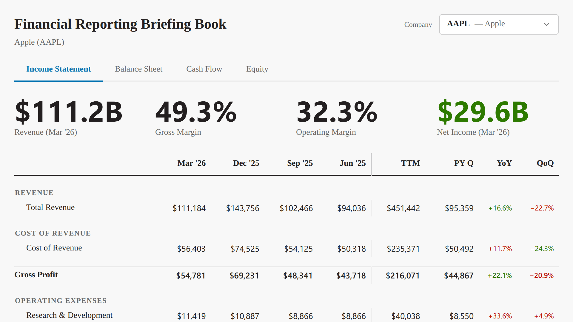
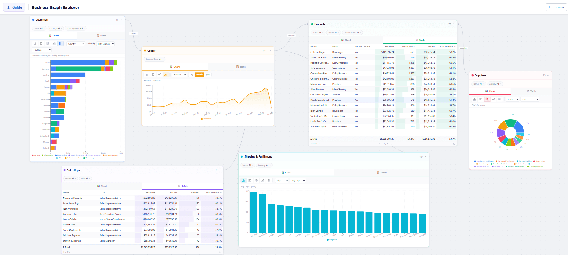
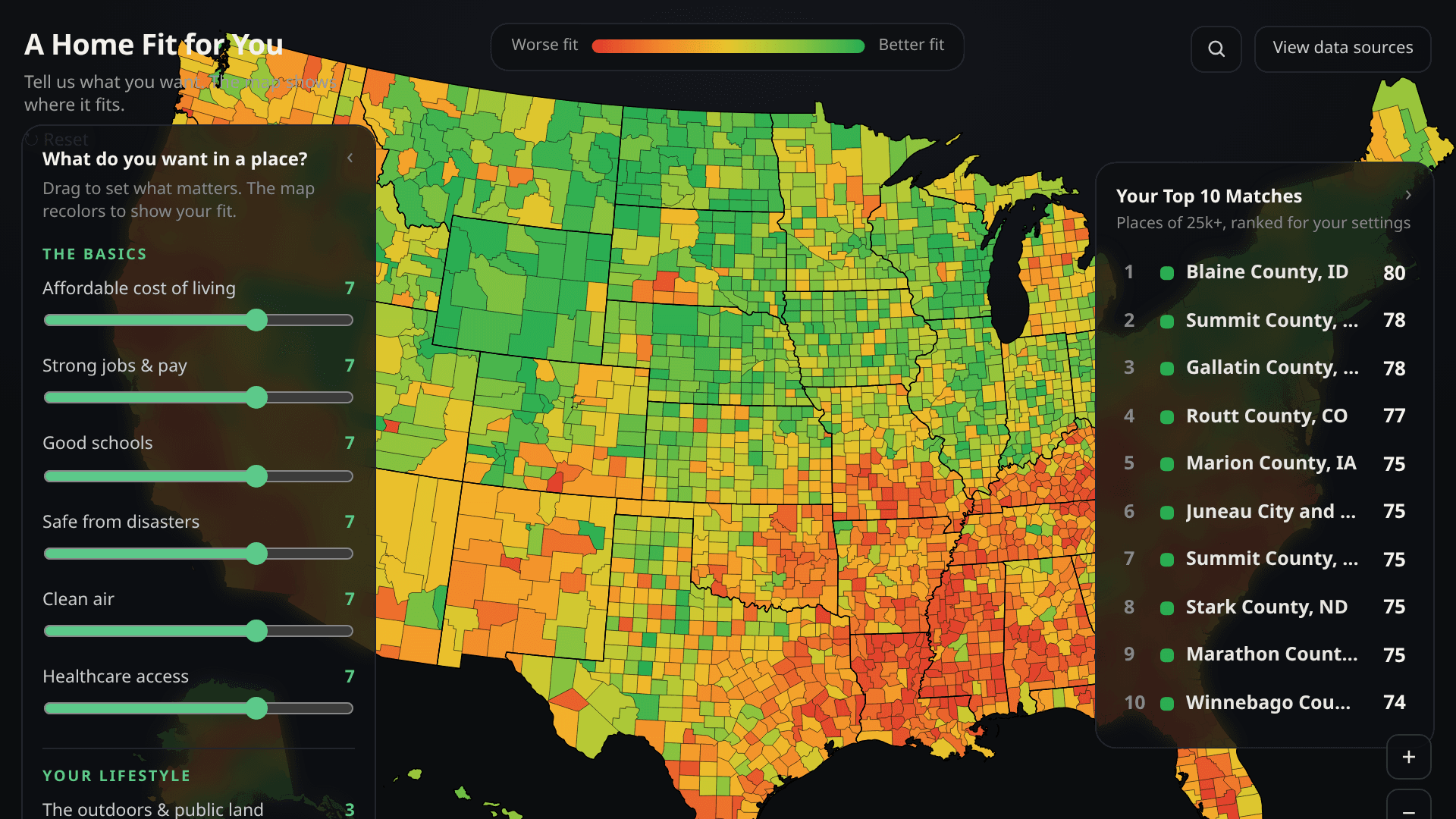
Business Graph Explorer
ExplorerData VizDashboardFinance


Click to Open Interactive Dive
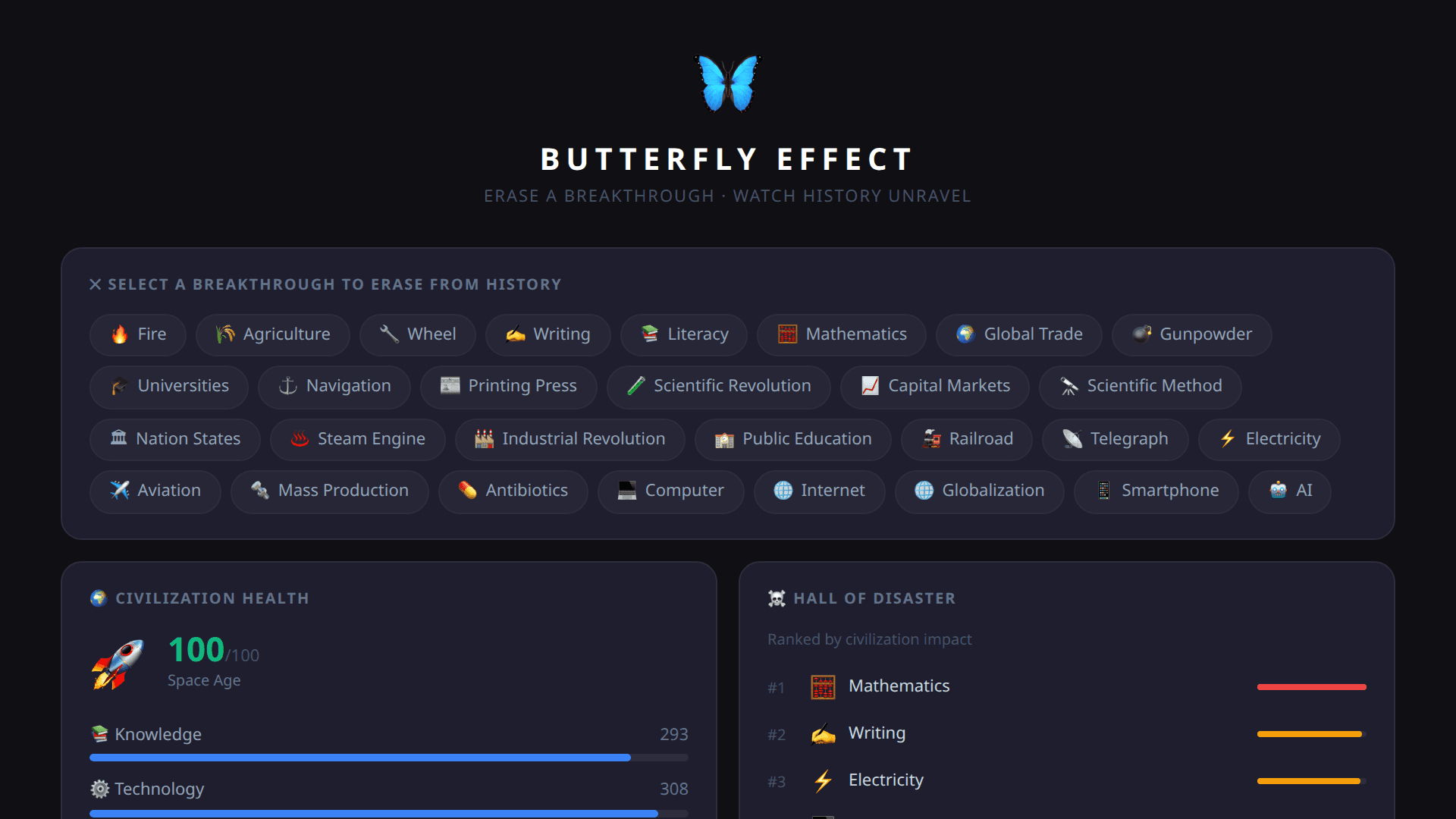
Butterfly Effect: Rewrite Human History
GameMotherDuckDashboardData Viz