← Browse Dives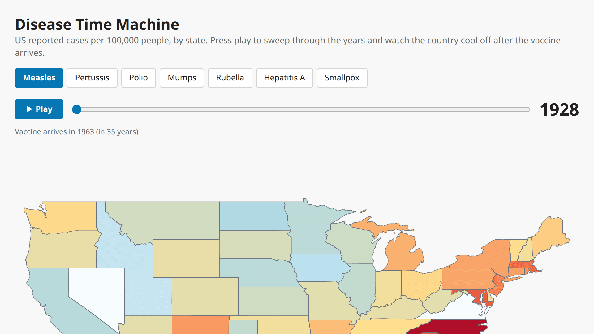
Loading Interactive Dive...
Disease Time Machine — Animated Map
Animated US choropleth map of contagious-disease incidence (per 100k) by state, 1928–2011. Play button sweeps through the years; a national trend strip marks the vaccine year. Switch diseases to watch the map cool after each vaccine. Data: Project Tycho (R. Irizarry).
MapScience
Author: zahle+demo@thesys.dev · June 22, 2026 Region: us-east-1
AI Prompts Used
1Prompt 1
I have the MotherDuck MCP connected. Build me an animated "Disease Time Machine" Dive that shows how US contagious diseases collapsed after their vaccines were introduced.
Data: Load https://raw.githubusercontent.com/firasm/bits/master/us_contagious_diseases.csv into a MotherDuck table with read_csv_auto. It has columns disease, state, year, weeks_reporting, count, population — 7 diseases (Measles, Pertussis, Polio, Mumps, Rubella, Hepatitis A, Smallpox), 51 states, 1928–2011. Also load a US states GeoJSON (https://raw.githubusercontent.com/PublicaMundi/MappingAPI/master/data/geojson/us-states.json) into a geometry table, storing each state's name, geometry type, and coordinates as JSON.
Visualization: An animated US choropleth map. Each state is shaded by reported cases per 100,000 people (count / population * 100000) for the selected year. Include:

A disease selector (buttons), defaulting to Measles
A Play button + a year scrubber slider, with a big year readout
A line under the map showing the national trend over time, with a dashed marker at the vaccine year and a playhead at the current year
A status line that says how many years before/after the vaccine the current year is
Hover on a state to show its exact rate
Comments
Log in to leave a comment.
No comments yet. Be the first!