← Browse Dives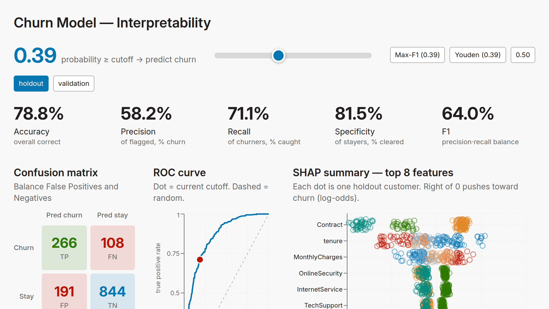
Loading Interactive Dive...
Machine Learning Interpretability Dashboard
Interactive interpretability dashboard for the XGBoost Telco churn model: headline holdout metrics, an interactive decision-cutoff slider, live confusion matrix + precision/recall/F1, probability distribution, ROC & PR curves, feature importance (mean|SHAP| / gain / weight / cover), a SHAP beeswarm, and a calibration/reliability plot. Reads telco_churn.ml.* (latest model run).
DashboardAIMotherDuck
Author: Alex Monahan · June 18, 2026 Region: us-east-1
AI Prompts Used
1Prompt 1
Use a MotherDuck flight to pull the Telco Customer Churn dataset from IBM's public GitHub mirror into MotherDuck. Design it to be an incremental load that is idempotent (no duplication even if I re-run it). Use data engineering best practices including logging, retries with exponential backoff, and others that you decide are helpful (do some research!). Then use XGBoost to predict churn or not within that Flight (research XGBoost best practices and data science best practices including how to use train/validate/holdout splits and prevent target leakage). Then, create a MotherDuck Dive to help me interpret the machine learning model (research machine learning interpretability best practices) including but not limited to the ROC curve, confusion matrix, shapley values, feature importance plots, etc. I also want to be able to tune the cutoff point and see the impact on the metrics. Be sure to store the predictions and other metrics about the quality of the model in a MotherDuck database. Make the dive beautiful. Make sure that there is no chart junk (and use some color when it is helpful).
2Prompt 2
In the dive, remove: “XGBoost on the IBM Telco dataset. Metrics on the holdout split. Model 74dd9f6e · trained 2026-06-18 13:16 UTC · XGBoost 2.1.4 · SHAP & importances computed on the holdout.”
Also remove: Decision cutoff Move the cutoff to trade recall against precision. Everything below this control updates live.
Also remove: all the metrics in the first row
Then, swap the position of the ROC curve and the "Predicted probability by actual outcome" charts.
Then, remove the legend of the confusion matrix
Put the "Accuracy" metric to the left of the metrics instead of to the far right. It should be the first one.
3Prompt 3
Put the confusion matrix, ROC curve, and the SHAP summary charts in the first row of charts. Confusion matrix should get 25% of the width, ROC curve should get 25%, then the SHAP should get 50%.
4Prompt 4
Instead of the categorical values being grey in the SHAP plot, make each category its own color. Do not use red or blue though, since that would be confusing.

  Remove this from the description: Color = feature value (low → high).

  Put a description under the confusion matrix header: "Adjust cutoff to balance False Positives and False Negatives"

  Align the bottom of the confusion matrix, ROC curve, and SHAP plot so that they look approximately the same height. Make the confusion matrix into a square with 4 equally sized boxes in it (height = width for the boxes).
5Prompt 5
Put the numeric SHAP features back to using the red to blue scale from before. Change the circles to have transparent fill (no fill), but have a colored outline instead. Make the outline partially transparent as well.
Comments
Log in to leave a comment.
No comments yet. Be the first!