← Browse Dives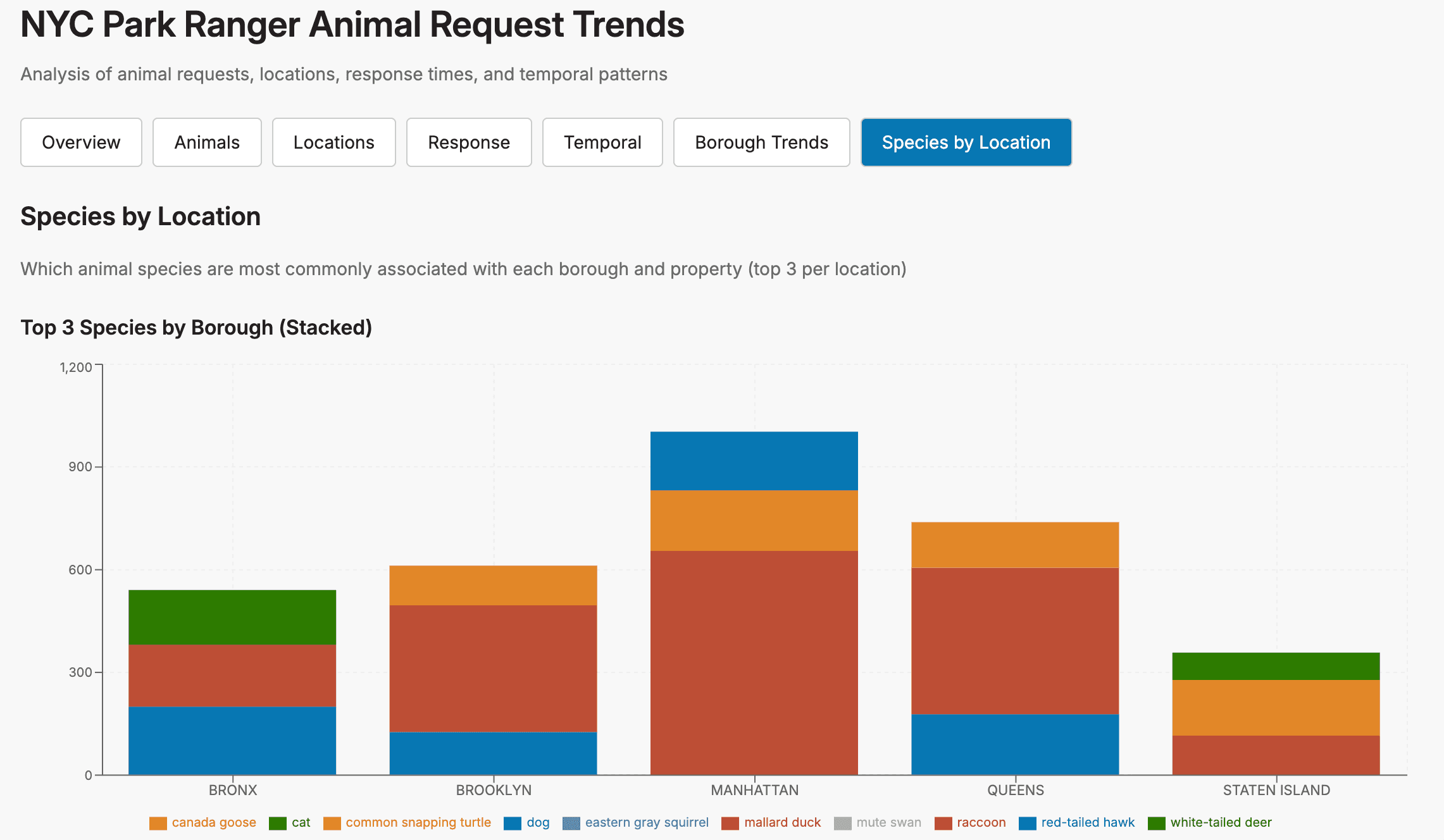
Loading Interactive Dive...
NYC Park Ranger Animal Request Trends
An analysis of animal-related requests completed by NYC Park Rangers since 2018, animal characteristics, locations, response times, and temporal patterns. Generated by Mistral Vibe Chat in Think mode.
DashboardNYCCivicExplorerData Viz
Author: Amy Ngo · June 19, 2026 Region: us-east-1
AI Prompts Used
1Prompt 1
See what tables I have in the database my_shared_db.
2Prompt 2
Describe the schema of the `nyc_park_ranger_completed_animal_request_data` table, what the columns in the table contain, and how the columns are connected.
3Prompt 3
Create a Dive that illustrates trends in the requests in the table pertaining to the animals (their species, condition, and age, and how many are present) that trigger a request, where they're found (borough, property, and location), how long it takes for the ranger to respond to a request after the request is first logged, and how these metrics have changed with season, day of the week, and time of the day. Take your time to think carefully about the cleanest, most robust way to do this before doing it.
4Prompt 4
I think this is great! Here is my feedback:
* Let's use a pie chart to illustrate the full species distribution in the data
* Let's also show trends in requests and avg response time by borough by hour of the day, day of the week, and the month when the request was first logged, if possible
* Let's also show trends in animal species by borough and most common property, if possible
5Prompt 5
On 2nd thought, please revert from the pie chart illustrating the full species distribution in the data to a bar chart of the 10 most common species (your original design for this metric). And if you think this would be good for visibility, please change the species by location and property charts to stacked bar charts showing the top 3-5 most common species by location or property.
6Prompt 6
This is great! Some charts are missing some tick labels for their x- or y-axis. Please resize the chart, change the tick label text size, and/or rearrange the layout so that no chart is missing tick labels, making sure that the final results are as clean, clear, and easy to read as possible.
7Prompt 7
1 last request: could you resize the scrollable legend for the Top 3 Species by Property (Stacked) chart and/or move it to the blank portion of the chart so that it doesn't obscure the tick labels? Also, please make sure that all the tick labels for the chart are present and visible.
8Prompt 8
Sorry, but 1 last last request: do you think it would be cleaner to change the Top 3 Species by Property (Stacked) chart to a horizontal stacked bar chart? Currently the tick labels are being cut off. Perhaps it would help visibility to have the Top 3 Species by Borough (Stacked) chart occupy the top half of the page, then the Top 3 Species by Property (Stacked) chart as a horizontal stacked bar chart in the bottom half of the page with its legend.
Comments
Log in to leave a comment.
No comments yet. Be the first!