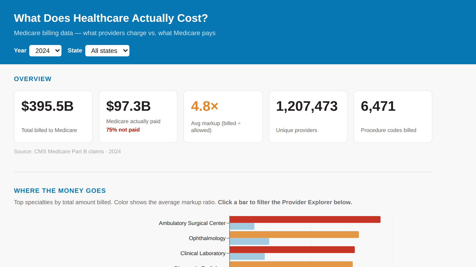
What Does Healthcare Actually Cost?
An interactive public dashboard exploring Medicare Part B and Part D billing data from 2019–2024. Covers what providers charge vs. what Medicare pays, broken down by specialty, procedure, geography, and drug. Includes a US state tile map of markup ratios, a hospital vs. doctor's office price gap comparison with state-vs-national overlay, a sortable provider explorer with search and pagination, and a drug spend section powered by Part D prescriber data. All sections respond to shared year and state filters. Powered by 2 CMS datasets in my_db: • cms_prov_svc — 58.7M rows. Core Medicare Part B claims fact table. One row per provider (NPI) × procedure (HCPCS code) × year, spanning 2019–2024. Drives the Overview KPIs, Where the Money Goes, Price Map, Price Gap, and Provider Explorer sections. • cms_partd — 4.3M rows. Pre-aggregated Medicare Part D drug spend by drug, specialty, state, and year (2019–2024). Drives the Drug Spend section. #Healthcare
AI Prompts Used
I want to build a multi-section dashboard Dive called 'What Does Healthcare Actually Cost?' for a general audience with no clinical background. It should have 5 sections: 1) Overview with KPI summary cards, 2) Where the Money Goes — spend by specialty and procedure category, 3) The Price Map — geographic variation by state, 4) The Price Gap — same procedure at hospital vs doctor's office, 5) Provider Explorer — sortable table of individual providers. Add a shared filter for year and state that applies across all sections.
Comments
Log in to leave a comment.
No comments yet. Be the first!