Introducing the Column Explorer: a bird’s-eye view of your data
2024/02/14
BYSubscribe to MotherDuck Blog
Today, we're releasing the Column Explorer, a new UI feature that enables you to interactively visualize the columns in your tables and query result sets. Take a look here:
We built the Column Explorer for a simple purpose: to reduce the amount of repetitive SQL needed to do basic exploratory data analysis. As practitioners, we’ve grown used to writing a separate set of queries to figure out the number of distinct values, the prevalence of NULL values, and summary statistics & distributions of the columns in our tables. But we’ve always felt that getting these basic insights shouldn’t take so much energy; just think of all the times you’ve written a throwaway SELECT count(*) statement over the years.
The Column Explorer replaces these tedious ad hoc queries with fast, automatic sparklines and summary statistics, enabling you to quickly answer diagnostic questions while keeping focus on the actual queries you’re trying to write. It’s the missing birds-eye view of your data you’ll wish you always had.
And it’s fun to use, too. Try it out at app.motherduck.com
Here are some parts of the Column Explorer we’re excited about:
It leverages DuckDB’s speed and MotherDuck’s hybrid execution model.
To make the Column Explorer feel good enough for everyday use, it has to generate aggregates and render its visualizations as fast as possible. Of course, performance is a subjective UX concern. We tend to anchor our expectations of performance based on the workloads we care about and the size of data we’re processing; for instance, you’re probably happy to wait a little longer to visualize a hundred million rows than you would for a hundred thousand.
MotherDuck’s hybrid execution model allows us to exceed these expectations; because we run DuckDB both in the browser and on the server, we aggregate your data in whichever location gives you the fastest results.
For larger dataset sizes, we can quickly aggregate the data on MotherDuck’s infrastructure and visualize it in the browser. You can get a sense of the rough performance differences from 3 million to 30 million rows by seeing three different datasets render side-by-side:
Every query run in our UI also caches the result in the browser using DuckDB-WASM. In some cases, this enables the Column Explorer to aggregate and visualize your data faster than your eyes can pick up, with zero network latency. The difference between “fast” and “near-instant” is dramatic.
Here are three examples:
High-density, easy to read. The Column Explorer contains a large amount of valuable summary information in a tight space. This design enables you to quickly identify patterns in the data by exploiting your brain’s capacity for pre-attentive processing; sensory inputs such as colors, widths, and shapes are processed much faster than conscious thought.
Details on demand. If you see something interesting in the column list, the natural next step is to dig in and look deeper at it. You can click on any column to see the top values, larger distribution plots, maximums and minimums, and other summary statistics.
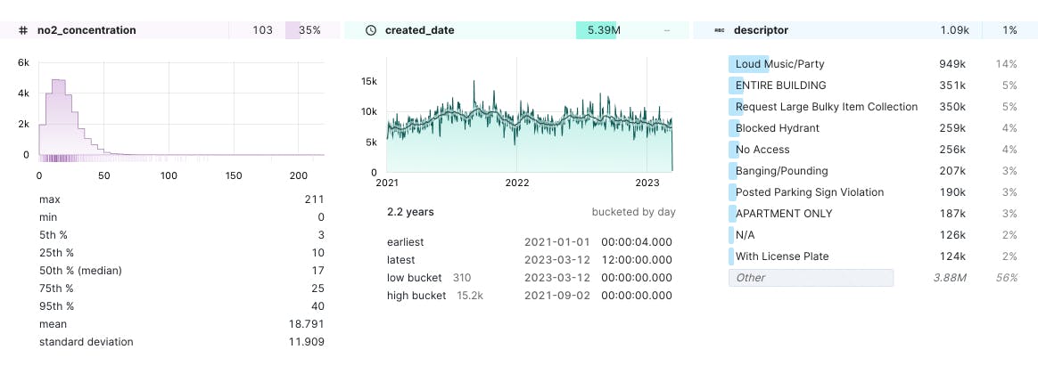
Copy values in the Column Explorer, everywhere. It’s easy to extract data out of the Column Explorer. You can copy ranges, values, and labels out of the component and paste back into your queries. This makes it much easier to refine your query based on the underlying data.
Here are a few things we’re looking forward to adding in the future:
Multi-select actions. At its heart, the Column Explorer is a list of columns. We’ll be shipping different ways to select columns in the list and do something with them; for instance, create a new query that contains only the selected columns, or select a bunch of columns and generate an EXCLUDE clause.
Interactive scrubbing and filtering. Thanks to hybrid execution, the most exciting feature to look forward to is interactively filtering your result set through interactions with the detail views. Imagine being able to scrub a time series chart and filter all of the data by the selected range; or excluding all rows that have specific value.
We think the Column Explorer is the missing companion UI for data analysis we’ve always wanted. Try it out and give us feedback on Slack.
The Column Explorer is just one of many examples of how MotherDuck isn’t your typical database company. If you’d like to push the limits on design, data visualization, and cutting-edge frontend technologies, we’re hiring!
Subscribe to MotherDuck Blog