I've built a lot of dashboards. dbt models into Power BI, analytical python into Hex notebooks, excel into powerpoint (regrettably). The pattern is always the same: write the query (or formulas), pick the chart type, fight with the formatting, realize some key data is missing, go get that data, look into the nuance of formatting a specific chart, realize the axis labels are wrong, fix it, ship v1, then get a slack or email that starts with "quick question".
Using Dives instead mean I can skip the monotony and focus on the real work.
Dives are interactive data apps you build through conversation with an AI agent, directly on top of your data in MotherDuck. You ask questions in plain language, the agent writes the SQL, builds a React visualization, and saves it to your workspace. You talk to Claude, and a live, interactive thing comes out the other end.
I've been using them for a few weeks now — with different datasets, different goals, but converging on a common workflow. This is the workflow.
What you need
- A MotherDuck account
- Claude (web or desktop) connected to the MotherDuck MCP Server
- Data you want to explore
- Access to Opus 4.5+ (testing with Sonnet has gone poorly, but we just launched some new system prompts that work better with Sonnet 4.6)
That's it. You open Claude, start talking, and build from there.
 The secret ingredient for Dives? Taste.
My workflow
After building many of these, I've noticed the same four phases every time. The specifics change — sometimes I know what I'm looking for, sometimes I don't — but the shape is consistent.
Phase 1: Context Hydration
My first message is never "build me a dashboard." It's something like:
lets look at the nba_box_scores data in motherduck
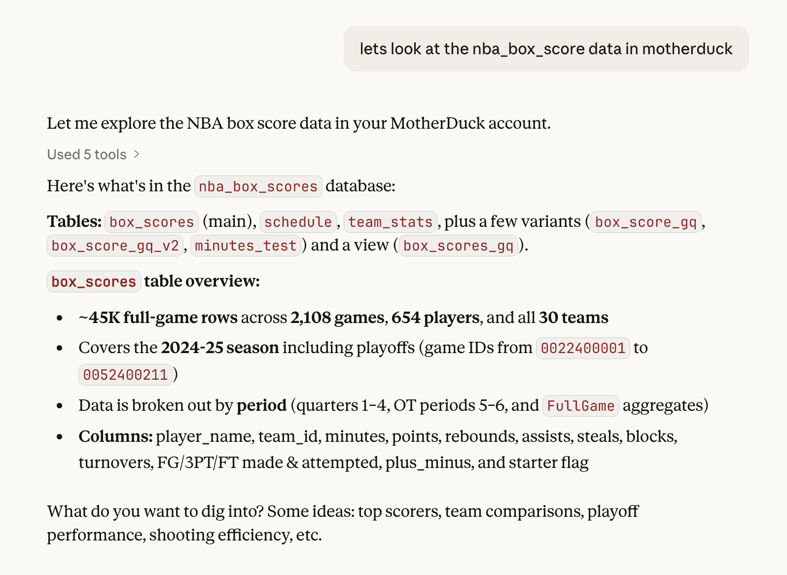
I'm vague on purpose. Claude already knows the MCP tool descriptions and uses list_tables, list_columns, and sometimes samples some rows & checks cardinality. It comes back with a lay of the land: table relationships, row counts, interesting columns, key stats.
This is the equivalent of clicking through tables in a data catalog, except I can ask follow-up questions:
box_score_gq - what is in there?
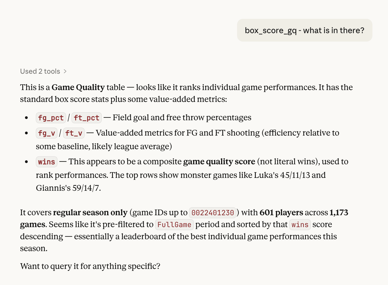
I'm just poking around to hydrate the context into Claude. I often have a decent idea of what I want to do, but I don't reveal it yet.
Why does this matter? Dives are built on live SQL. If Claude doesn't understand the shape of your data first, the queries it writes later will be wrong. One turn on exploration saves five turns of debugging.
Note: This experience comes from the work I've been doing on text-to-SQL evals, too.
Phase 2: Shaping the narrative
Once I'm confident the model has enough context, I start shaping the Dive. This part is more art than science. I'm typically bringing an idea I already have in mind and combining it with what Claude noticed along the way.
Sometimes I find the story by exploring outward:
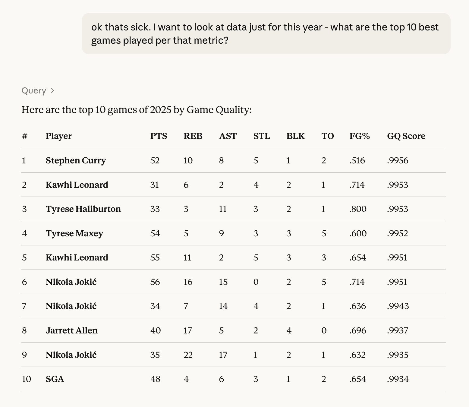
ok thats sick. I want to look at data just for this year - what are the top 10 best games played per that metric?
or:
explore the facets of this data(this is a good one when I don't know what I want yet.)
Occasionally, I already have some of the SQL I want, or an existing report or dashboard. Either can be copy-pasted or screenshotted and added into the conversation. Claude reads it and uses it as the further context for the Dive. This cuts down on the debugging because you are giving more direct instructions on what you are looking for.
Both approaches, exploring to let the data tell you what's interesting and handing Claude the insight lead us to the same destination: going from "show me data" to "build me a thing."
I do a little bit of pre-Dive tuning here as well:
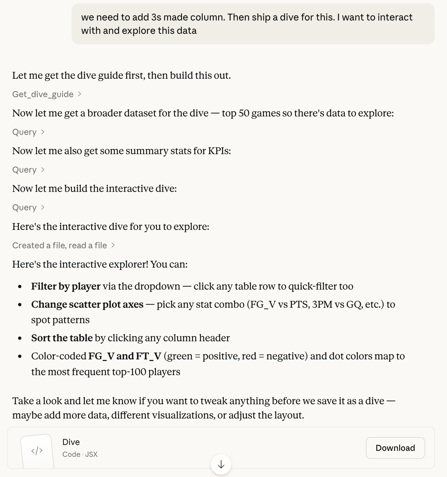
we need to add 3s made column. Then create a dive for this. I want to interact with and explore this data
Phase 3: Iterate on the artifact
When Claude creates a Dive, it doesn't go straight to MotherDuck. It builds a preview artifact right in the chat — a local version with sample data that you can see and interact with right away. Now the design work begins.
I give feedback the same way I received it as a young analyst. Sometimes I'm specific:
Ok lets change the column order in the detail table. After PTS, move 3PTM, then FG%, then FT%. Keep everything else the same.
make dots 2px bigger
nit - when you filter on a player, it changes the height of the rows sometimes. The row height should be fixed.
Sometimes I'm directional:
getting warmer. Match the colors with scatter and the box plots
this is feeling great - however - i still don't love the orange box + count in the heatmap. any better way to show this?
And sometimes I just don't know what's wrong:
I dont love this dive, I want to use it to explore and see if there any anomolies in the data make it interactive and explorable
ok the box plot is confusing, what is supposed to be measuring on the y-axis? its super unclear.
This doesn't have to happen in one sitting, either. The NBA game quality explorer took about eight sessions over a week. I'd open it up, refine a few things, close it, go do other work. Come back the next day with fresh eyes and notice something I didn't before. For me, Dives are a background task. I chip away at them.
Through this process, I've learned about giving good feedback to the models. Here is what has worked well:
Describe the WHY, not just the WHAT. When I told Claude "we want to emphasize putting a player in context," it made better decisions about color schemes and layout that I hadn't even thought of. Compare that to "make the orange brighter." Claude does the thing, but nothing else improves.
Stack related changes, separate unrelated ones. When three fixes are connected to the same interaction model, I put them in one prompt:
ok great, we can show the entire data set in the scatter plot BUT the table below should be paginated by 50 rows at a time, with arrows where the user can navigate (also, the filter on player should show all games for that player, highlight them in the scatter, but not remove the dots
When they're independent, one at a time. Dense prompts work when everything's related. It's harder to succeed when you're mixing concerns.
Kill ideas fast. I tried adding correlation matrices in along the way of the NBA Dive build. I ended up removing them almost immediately. It took some iteration to get to what I liked, and each attempt took one or two prompts. Don't be afraid to move on quickly.
Let Claude propose, then choose. When I don't have a solution, I ask an open-ended question:
this is feeling great - however - i still don't love the orange box + count in the heatmap. any better way to show this?
Claude gave me three options. I picked and refined:
i think I prefer 2. if there are multiple dots in a box, we should offset them slightly/fuzz them so its clear where there more than 1 (like a scatter)
When I'm stuck, this is a great hack for moving forward.
Phase 4: Save and test in MotherDuck
Once the artifact looks good enough, save it to MotherDuck.
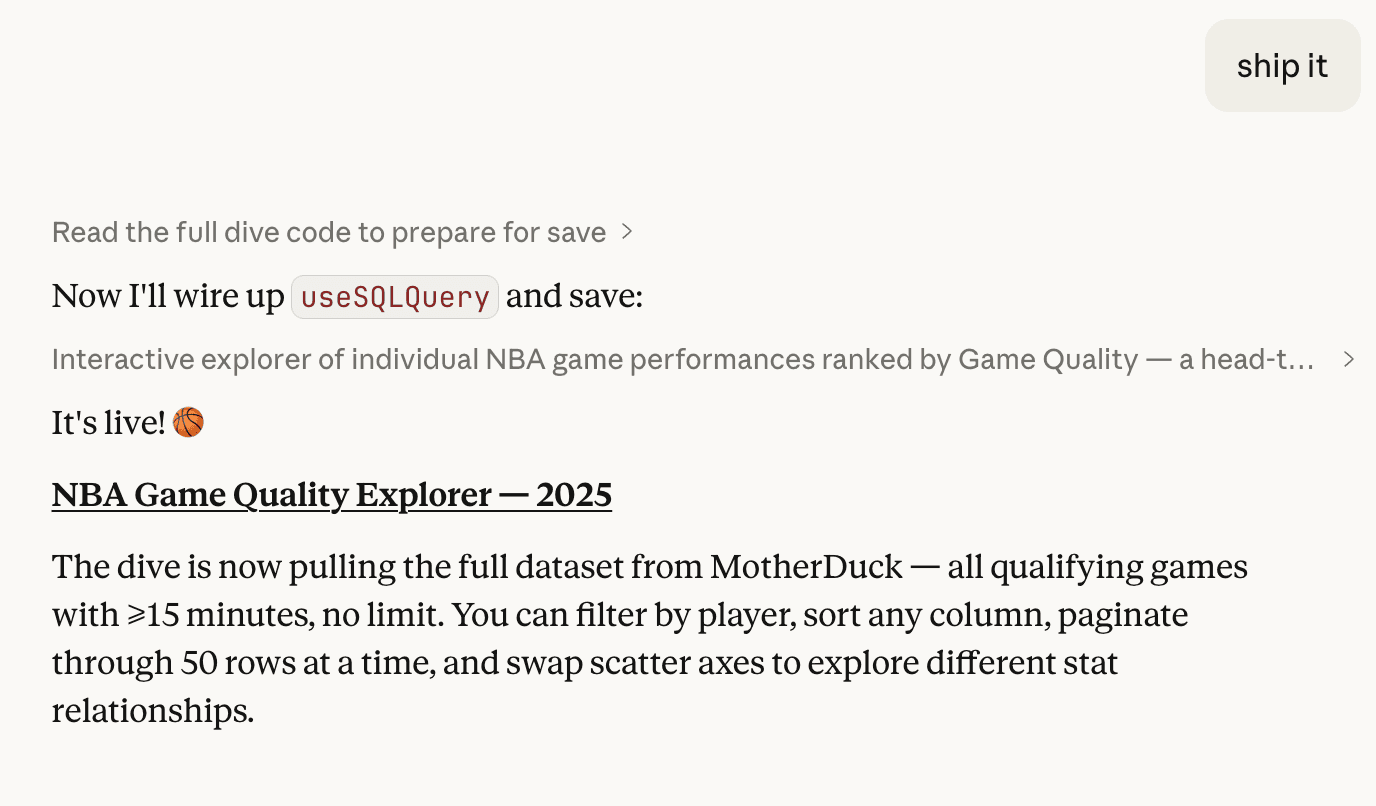
The preview artifact uses a subset of the data to save context. MotherDuck runs actual queries against your database. Because they have different data volumes, the interaction feels different in React.
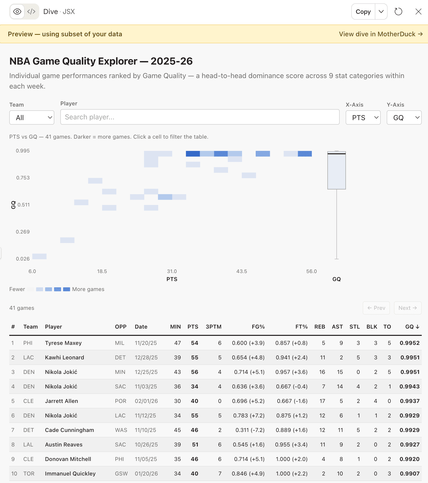
One discovery that only showed up after saving was that my scatter plot was fine with sample data. With a full season of NBA box scores, it was unusable. The fix was switching to a heatmap with auto-binning, which turned out to be a better design anyway. The heatmap was actually more useful for putting individual games in context.
Another issue:
so the click interaction isn't working on the motherduck side for some reason.
Recharts' onClick handlers didn't fire in the dive sandbox. Only discovered this after saving. Claude went through two iterations before landing on pure HTML buttons as the chart interaction.
the height change didn't seem to make it to motherduck
when i click on a row, i'm seeing height changes on the row in motherduck
You only catch these by testing in "prod". When you hit one, go back to the conversation in Claude, fix it, save again. The loop is tight: iterate locally, save, test, fix what broke.
Things that trip people up
Some things I've picked up the hard way:
Check the SQL before you publish. During iteration, Claude sometimes adds USING SAMPLE 2000 or LIMIT clauses for performance. Fine for the artifact, but not fine for the real thing.
Paste exact errors. When something breaks, paste the error text. Don't describe it.
why am i seeing this error: Database(s) not found: cybersecurity_ops_copy (md:cybersecurity_ops_copy)
Claude debugs faster with the actual message. It identified the root cause (a misconfigured REQUIRED_DATABASES export) immediately.
Remember it's React. Dives are React apps, not static reports. If Claude defaults to a report-style layout, nudge it:
oops i forget we are using a Dive, which is interactive. We should focus on making it interactive so that user of the Dive can find the Insight I provided.
instead of pages, use tabs, since we have react available to use. treat it like an SPA
Zoom out. Sometimes I'll find something interesting and drill into it. When I save, I work backward, refactoring the Dive so that a user could discover that same insight through exploration. It takes some effort, but the result is a tool that surfaces real information, not a report that hands you a conclusion.
Check the SQL before you publish. I'm saying this twice. Just because Claude writes SQL that looks valid doesn't mean it's right. Use your brain to validate the model.
In Summary
Here's what I keep coming back to:
- Explore first. Let Claude orient itself before you ask for anything specific.
- Find the story. Either discover it through exploration or hand it to Claude up front.
- Iterate on the artifact. Do the design work in Claude's preview. Chip away at it across sessions.
- Save and test in MotherDuck. Real data behaves differently than sample data. Test it.
- Be honest when something isn't working. "I don't love this" is a perfectly good prompt.
The whole thing feels less like building a dashboard and more like having a conversation that produces one. To me, that is beautiful.
PS - looking for a great dive to get started? Look no further!
MotherDuck Dives is in public preview. Read the announcement or check the docs to get started.
Start using MotherDuck now!