Your AI dashboard looks cool. Nobody learns anything from it
2026/04/10 - 9 min read
BYIt's never been easier to build a dashboard. Type a prompt, get JavaScript, and 30 seconds later you've got charts. Congratulations.
But does anyone actually learn anything from looking at it? Or do they just go "oh wow" and close the tab?
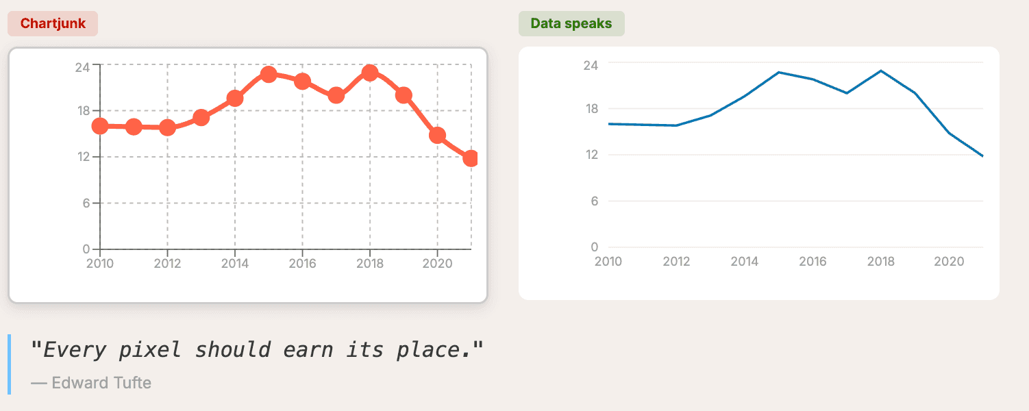
Look at these two dashboards. Same dataset. Same AI tool. Completely different results.
The difference isn't the tech — it's knowing a few fundamentals about data visualization before you hit enter on that prompt. Here are five steps that will make your vibe-coded dashboards actually useful, not just pretty.
I'll show the dos and don'ts with prompting tips along the way. The demo uses Claude and MotherDuck Dive, but these tips apply to any tool where you speak English and get JavaScript charts.
NOTE If you're interested in the broader picture of BI in the age of AI agents, we built a full guide on that: Guide to BI in the Agentic Era.The Dataset
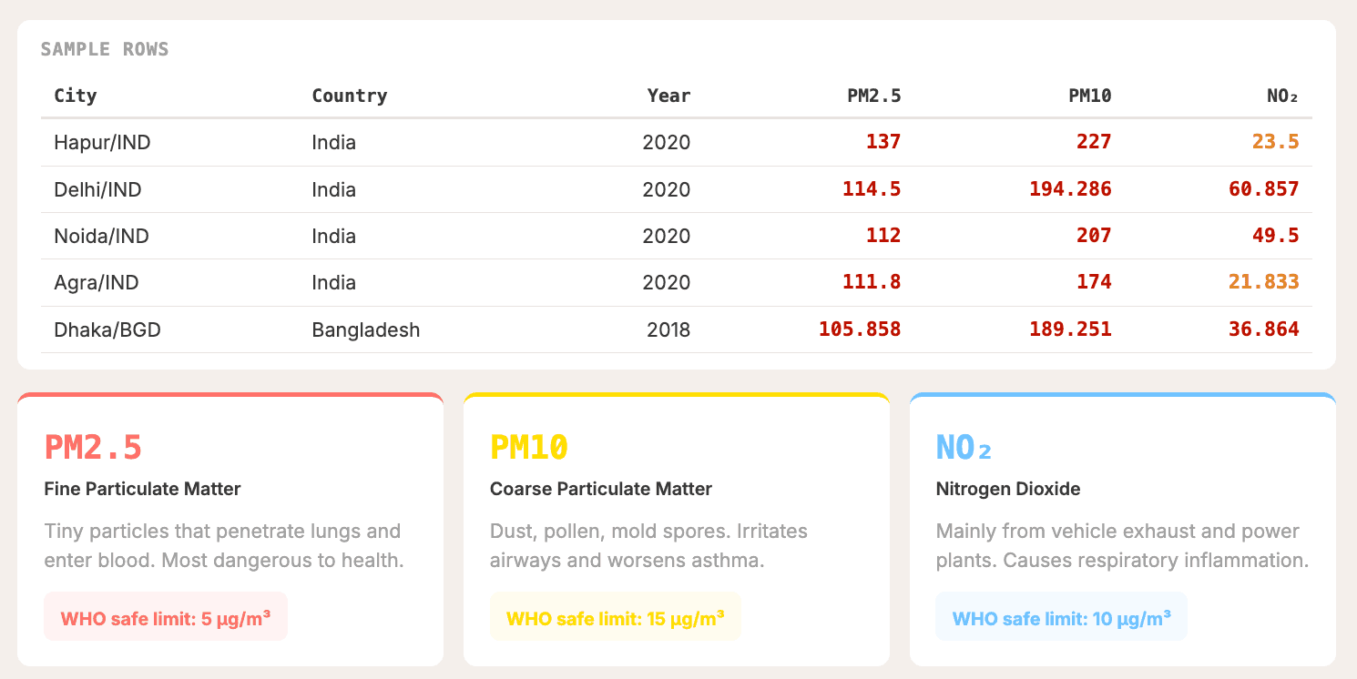
Our case study is the WHO Ambient Air Quality Database — PM2.5, PM10, and NO2 measurements across 7,000+ cities between 2010 and 2022. The measurement is always micrograms per cubic meter (μg/m³), and the higher the number, the worse your air quality.
Quick reference for PM2.5:
- ≤ 5 μg/m³: Safe (WHO guideline)
- 5–15: Moderate
- 15–35: Unhealthy
- > 35: Hazardous
Spoiler: a lot of cities are above the WHO recommendation.
The official source is an Excel sheet (yes, painful), but we've got you covered with a CSV and Parquet file on a public S3 you can use with your favorite data tool. And yes — you should use DuckDB, or at least tell your AI to use DuckDB.
Step 1: Start With a Question, Not a Chart
This is the classic mistake. You get excited, open your AI tool, and type something like "show me some data visualizations on this dataset." And you get... a wall of charts that say nothing.
Instead, answer three questions before you prompt anything:
- Who is the audience? A policy maker needs different views than a journalist or your grandma.
- What decision should this inform? If nobody acts on it, it's just decoration. Put it on your wall as a painting.
- What's the one key takeaway? If everything is highlighted, nothing is.
For our air quality dashboard, the audience is regular people — my grandma, my wife, anyone. And the story is: is the air getting cleaner in my city? Where and for whom?
Underneath that: how polluted is my environment, how does it compare regionally, is it getting better or worse, and what can I do about it?
And here's something cool. The question "what can I do about it" — the WHO dataset doesn't actually have that. It tells you where things improved, but not why. But your LLM probably knows why. Cities in China improved because of the Blue Sky Policy, for example. So let the data show you who improved, and the LLM tell you why. That's where the real knowledge lives.
Step 2: Match the Chart Type to the Question Type
Chart types equal question types, not decoration. There are frameworks for this, and you don't have to guess.
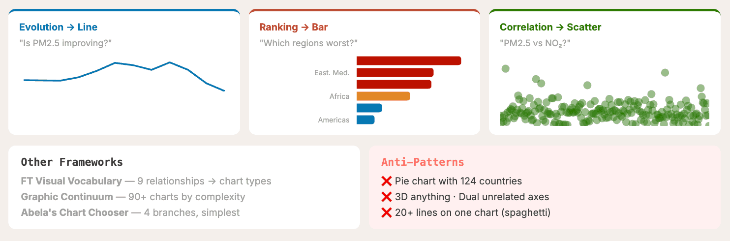
For our data:
- Evolution (is PM2.5 improving?) → Line chart
- Ranking (which regions are worst?) → Bar chart
- Correlation (PM2.5 vs NO2?) → Scatter plot
One of the best references I know is From Data to Viz by Yan Holtz and Conor Healy. It's a decision tree: what type of data you have, and what you want to show — distribution, ranking, evolution, correlation. Those answers narrow your chart choice to two or three options, and you prompt those specifically instead of praying the AI lord guesses it right.
 From data to viz decision tree
Pie vs. Bar: A Classic Example
Let's apply this directly to a classic anti-pattern. Both charts below show average PM2.5 by region. But with a pie chart, it's genuinely hard to tell the difference between angle slices. With a horizontal bar chart, the ranking is instant. Humans are great at comparing lengths, terrible at comparing angles.
Prompt tip: Be specific about the chart type. Don't leave it to chance.
"Add a horizontal bar chart ranking all world regions by their average PM2.5 concentration (highest to lowest) for the most recent available year, colored by WHO severity tiers (green ≤5, blue ≤15, orange ≤35, red >35) and annotated with a WHO guideline reference line at 5 µg/m³."
Anti-Patterns to Avoid
While we're at it — a few chart types that should almost never make it into your dashboard:
- Pie charts with too many categories (like 124 countries — please no)
- 3D anything
- Dual unrelated axes
- Spaghetti charts with 20+ lines
Step 3: Design With Intention
You've got the right chart type — now don't ruin it with bad design. Four principles.
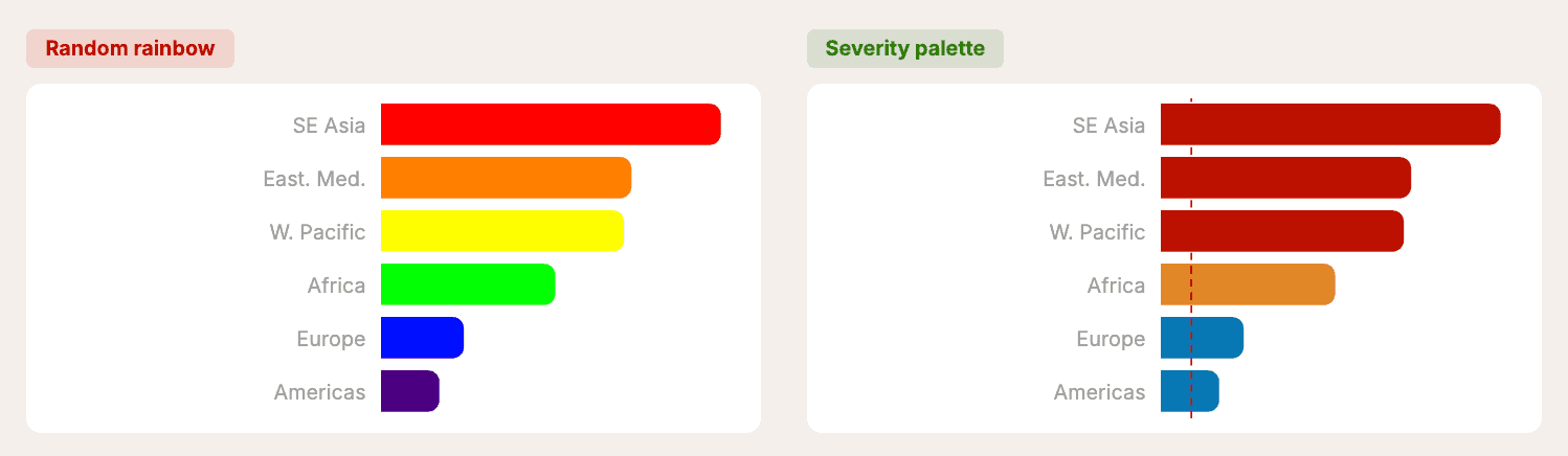
Color With Intention
Default AI dashboards use random rainbow colors with no meaning. Instead, use a severity palette where colors actually mean something:
- Green (#2d7a08): ≤ 5 — WHO safe
- Blue (#0777b3): 5–15 — Moderate
- Orange (#e18727): 15–35 — Unhealthy
- Red (#bc1200): > 35 — Hazardous
Keep it to five colors max. Stay consistent. Pass the hex codes directly in your prompt so the AI doesn't guess. Tools like ColorBrewer 2.0 can help you pick a palette if you're not feeling inspired.
Reduce the Clutter
This comes from Edward Tufte's The Visual Display of Quantitative Information. His principle: maximize the data-ink ratio. Every pixel on screen should earn its place.
In practice:
- Remove excessive gridlines — keep only horizontal light grey
- Remove chart borders and shadows
- Label directly when possible instead of using a legend
- No background fills on chart areas
Prompt tip:
"Use a minimal, clean design. Remove chart borders and shadows. Light gray gridlines only. No background fills on chart areas."
You can even mention Tufte by name — the LLM knows who he is.
Visual Hierarchy
People scan screens in an F-pattern — top-left first, then across, then down. Structure your dashboard accordingly:
- KPI cards — headline numbers at the top
- Primary chart — the most important trend (top-left)
- Supporting charts — ranking or comparison (below or beside)
- Detail table — exact numbers for deep dives (bottom)
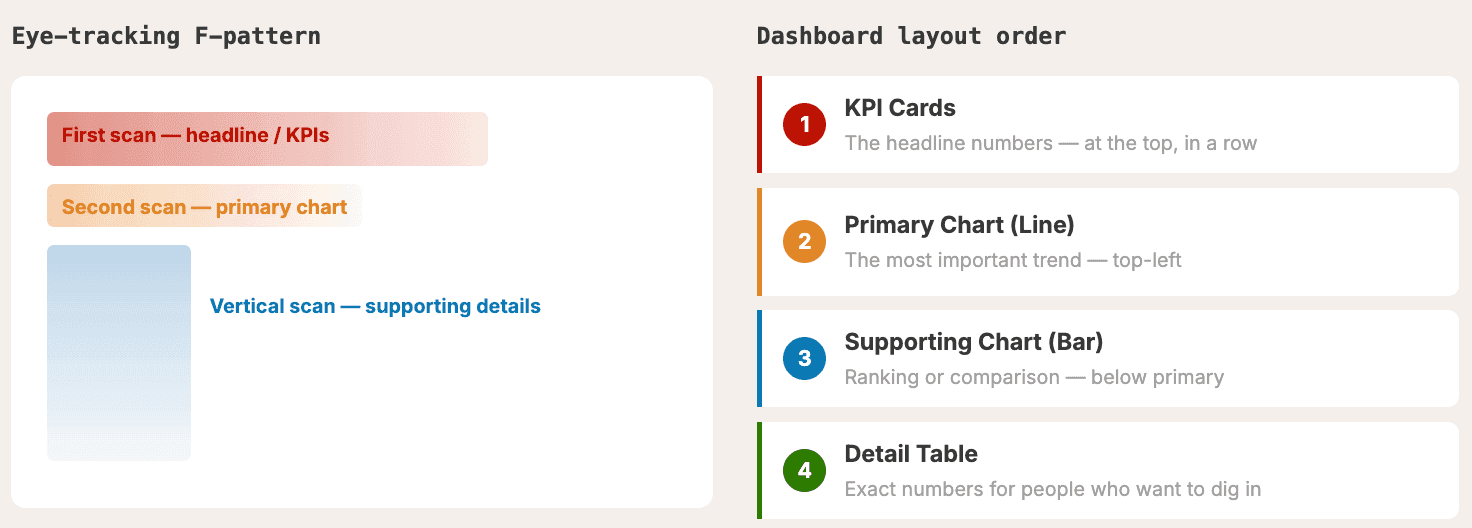
Prompt tip:
"Layout: KPI cards in a row at the top, then a line chart showing the global trend, then a bar chart ranking regions, then a table of top improving cities."
Specify the layout. It's really important so the AI doesn't guess for you.
Add Context
Numbers without context are meaningless.
- Add reference lines (e.g., a dashed WHO safe limit line)
- Annotate events (e.g., a vertical line for COVID-19 lockdowns — you'll see a drastic air quality improvement because we were all inside)
- Always start bar charts at zero — truncated axes exaggerate differences
- Include the data source and time period — always
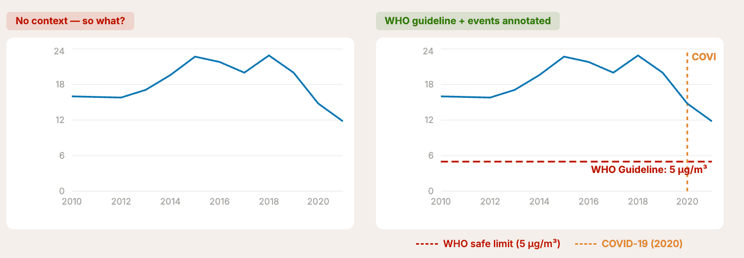
Prompt tip:
"Add a dashed reference line at PM2.5 = 5 labeled 'WHO Guideline (5 µg/m³)' in red. Annotate 2020 with a vertical dashed line labeled 'COVID-19 lockdowns' in orange."
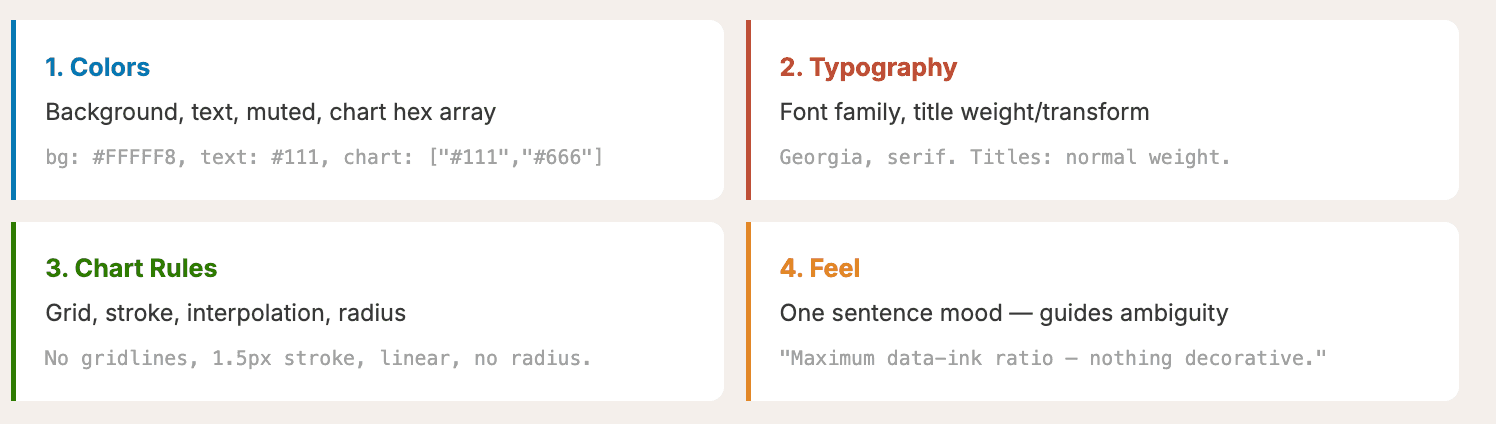
Pick a Theme
Colors, typography, chart rules, general feel — that's your theme. It should be consistent and feel like your brand. A few references to try:
- Tufte Minimal: Georgia serif, #FFFFFF background, maximum data-ink ratio — nothing decorative
- Knowledge is Beautiful: Inspired by David McCandless's book
- FT Salmon: The classic Financial Times look
You can pass any of these as a theme directive in your prompt, and the LLM will get it.
Step 4: Build a Narrative Arc
A dashboard should tell a story, not just display numbers. This comes from Cole Nussbaumer Knaflic's Storytelling with Data. If you read only one data viz book, make it that one.
The narrative arc:
- Setup — what's normal? (8,500+ cities measured worldwide)
- Tension — what's wrong? (93% exceed safe pollution levels)
- Insight — the "aha!" (Some cities cut pollution by 60%+)
- Action — now what? (How does your city rank? What can you do?)
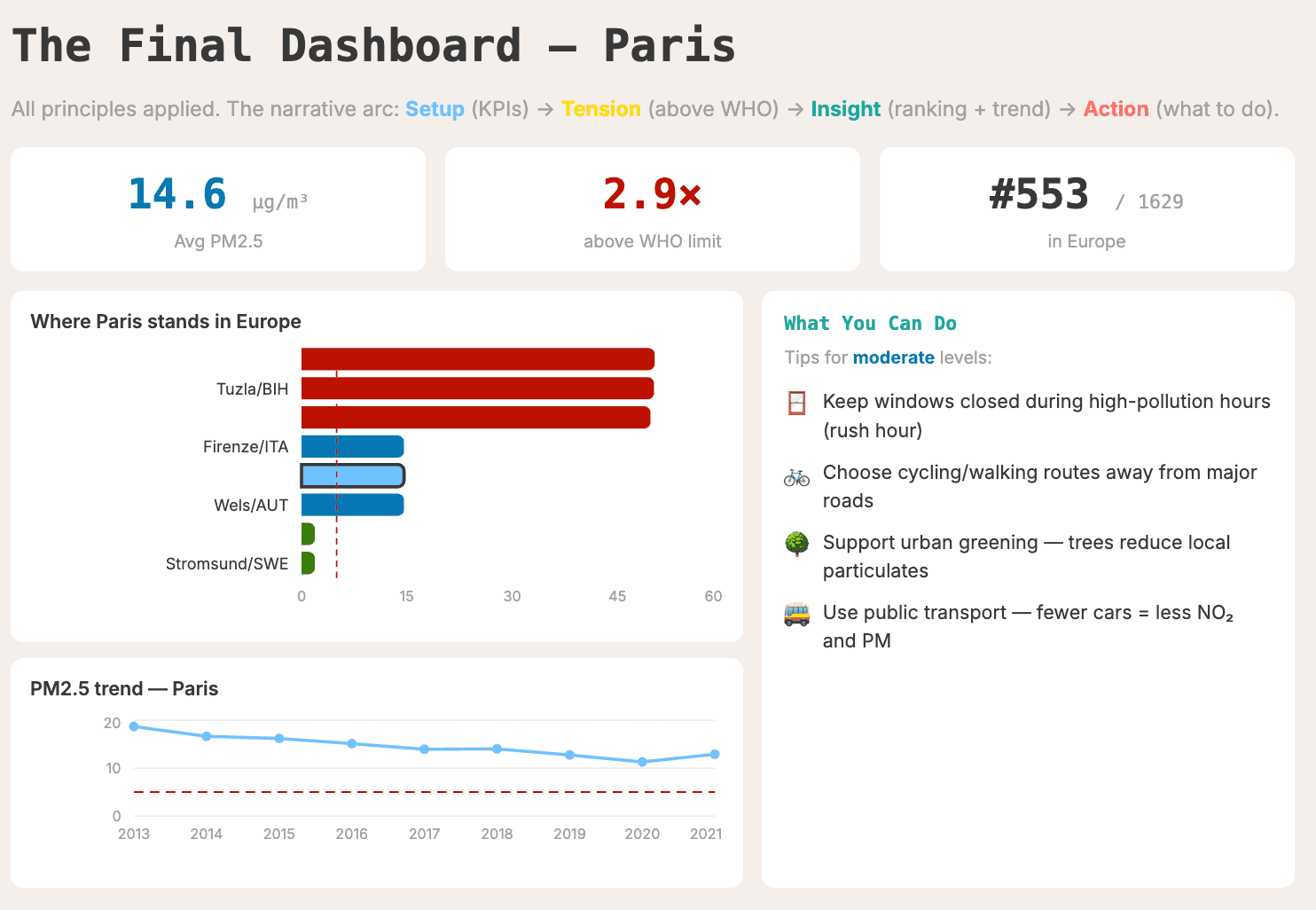
For our final dashboard on Paris, that translates to:
- KPI cards showing current concentration (in blue — safe zone, but still 2.9x above the WHO limit)
- A ranking showing how Paris compares to other European cities
- A trend chart showing the trajectory over the years
- Actionable tips on what you can do to improve air quality
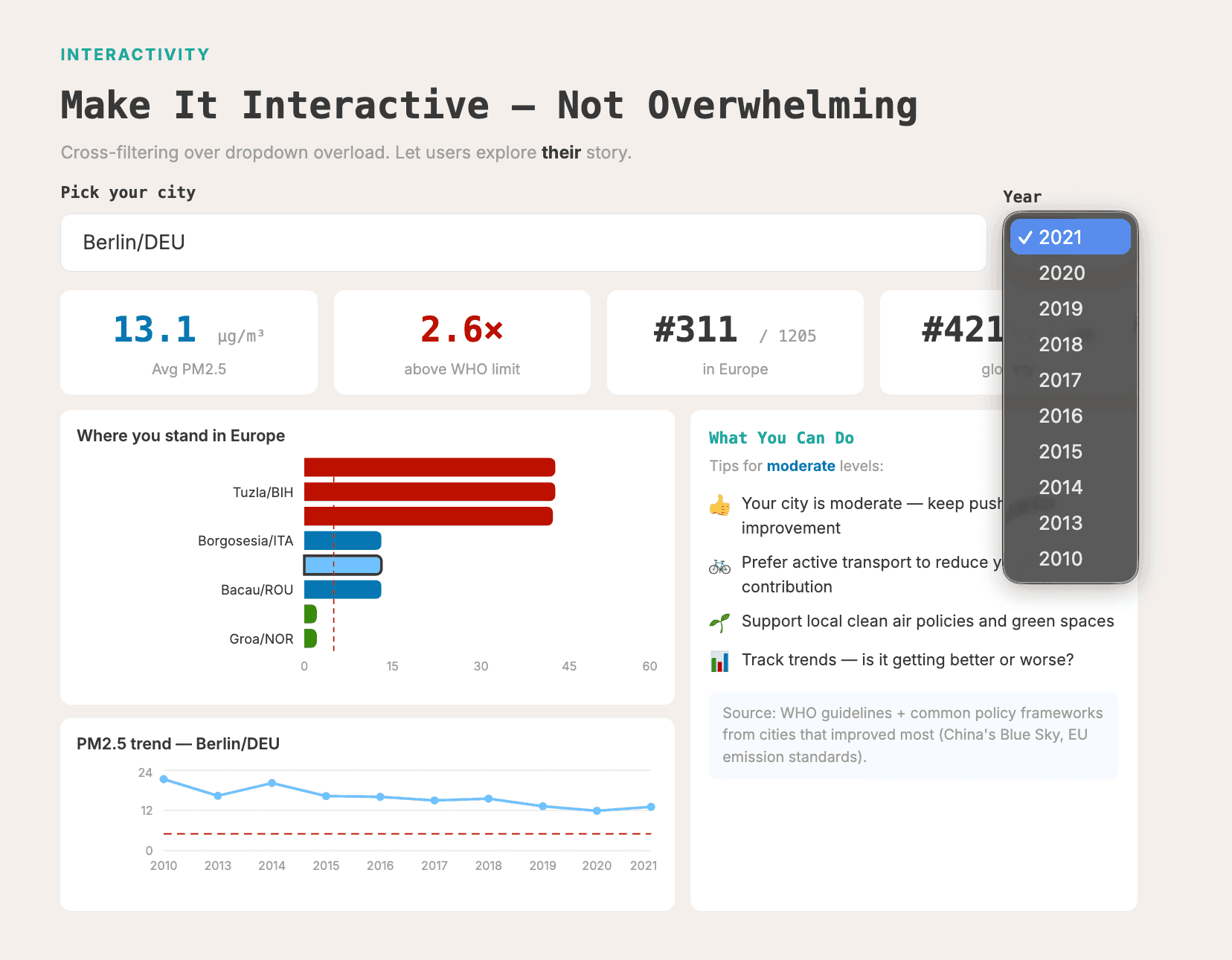
Step 5: Make It Interactive — But Not Overwhelming
Notice I didn't bring up interactivity until step five. That's intentional. Too many people slap filters everywhere from the start, and it just confuses users. Start with a static dashboard. Add interactivity only when follow-up questions arise.
When you do add it:
- City picker — search/select specific locations
- Year toggle — change the time range
- Cross-filtering — click a filter and it applies to all charts (otherwise it gets confusing)
- Tooltips — show extra detail on hover
Interactivity should support the narrative, not distract from it.
The Prompt Difference
Here's the thing. Taking these five steps and baking them into your prompt makes a dramatic difference.
Before (lazy prompt):
"Create some data visualizations from this dataset."
After (informed prompt): Includes the dataset path, narrative arc, specific chart types, hex color codes, layout instructions, reference lines, and interactivity specs.
Same AI. Same data. Night and day results.
Bonus: Make It a Reusable Skill
You might be thinking: do I really have to type all of this every time? Nope. You can turn these rules into a reusable system prompt or AI skill — a SKILL.md file that encodes the decision tree, blocks anti-patterns (no gradients, no 3D), and enforces design rules (spacing, typography, color palettes).
Even a lazy prompt produces dramatically better results when the skill is loaded.
But here's why I didn't lead with the skill: the AI follows the rules, it doesn't understand them. When something looks off — a clipped axis label, mismatched colors, an off-scale chart — you need to be the one who catches it. Dashboards are for humans. The final check has to be human too.
TL;DR
- Define a question before you touch a chart
- Match the chart type to the question type — use From Data to Viz
- Design with intention — theme, colors, layout, context lines
- Build a narrative — setup, tension, insight, action
- Add interactivity last — every filter should answer the next "so what?"
References
- From Data to Viz — Yan Holtz and Conor Healy
- The Visual Display of Quantitative Information — Edward Tufte
- Storytelling with Data — Cole Nussbaumer Knaflic
- Knowledge is Beautiful — David McCandless
- ColorBrewer 2.0 — Color palette tool
- Guide to BI in the Agentic Era — MotherDuck
Take care of your dashboards. Next time you vibe-code one, make it useful — not just "wow."
Start using MotherDuck now!