Step 4: Build a Preswald Dashboard
We’ll build three Plotly charts and present them with Preswald:
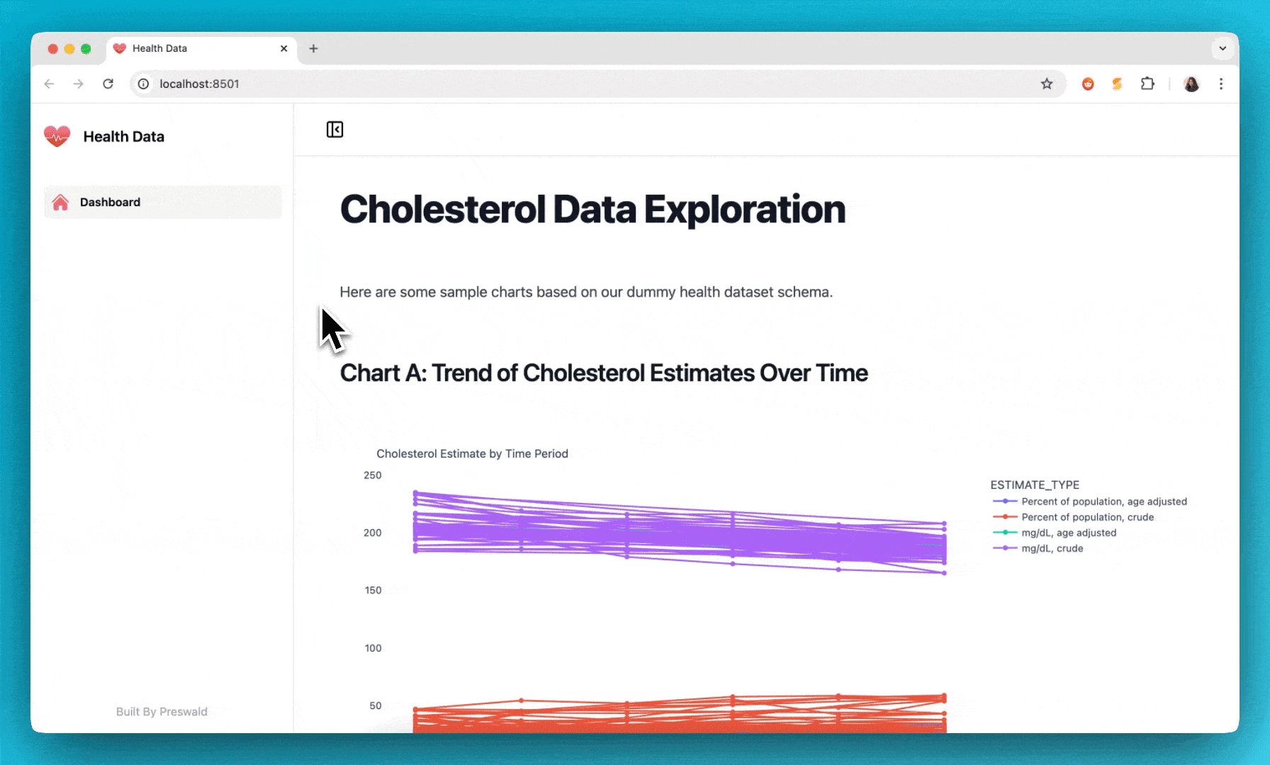
- A line chart showing cholesterol estimates over time
- A bar chart comparing age-adjusted vs. crude estimates
- A scatter plot to visualize estimates across different subgroups
Here’s the full code with comments explaining each part:
import pandas as pd
import duckdb
import plotly.express as px
from preswald import text, plotly, view
con = duckdb.connect("md:my_db")
df = con.execute("SELECT * FROM DQS_Cholesterol_in_adults_age_20").df()
text("# Cholesterol Data Exploration")
text("Below are several charts that help us visualize cholesterol estimates.")
text("## Chart A: Trend of Cholesterol Estimates Over Time")
df_line = df.dropna(subset=["ESTIMATE"]).copy()
fig_a = px.line(
df_line,
x="TIME_PERIOD",
y="ESTIMATE",
color="ESTIMATE_TYPE",
markers=True,
title="Cholesterol Estimate by Time Period"
)
plotly(fig_a)
text("## Chart B: Comparison of Age Adjusted vs. Crude Estimates")
fig_b = px.bar(
df_line,
x="TIME_PERIOD",
y="ESTIMATE",
color="ESTIMATE_TYPE",
barmode="group",
title="Age Adjusted vs. Crude Estimates"
)
plotly(fig_b)
text("## Chart C: Scatter Plot of Estimate vs. Subgroup")
fig_c = px.scatter(
df_line,
x="SUBGROUP_ID",
y="ESTIMATE",
color="GROUP",
size="ESTIMATE",
hover_data=["TIME_PERIOD", "ESTIMATE_TYPE"],
title="Cholesterol Estimate by Subgroup"
)
plotly(fig_c)
view(df)
con.close()
What’s Happening in Each Section
- Connect to MotherDuck: We use
duckdb.connect("md:my_db") to establish a connection.
- Fetch Data: A simple SQL query to pull all rows from the
DQS_Cholesterol_in_adults_age_20 table into a DataFrame.
- Preswald Text: We insert headings and descriptions (
text()) so people viewing the dashboard know what they’re looking at.
- Line Chart: Shows cholesterol estimates vs. time, separated by
ESTIMATE_TYPE.
- Bar Chart: Compares different
ESTIMATE_TYPE categories within each time period (grouped bars).
- Scatter Plot: Visualizes how
ESTIMATE varies by SUBGROUP_ID (e.g., an age or demographic marker), coloring by GROUP.
- View: Finally, we call
view(df) to render everything as an interactive web app.